Thursday, 28 October 2010

Deviant Art Raid: Atlantis

For more inspiration i decided to look though images on deviantart.com searching for digital art under the theme of Atlantis because it is a widely known name given to the sunken city that is also mentioned in the text. These are a couple of images that stood out for me...   

 
This piece is titled The Forgotten Atlantis, it really stood out for me because the light flooding in from the backgrounds light source adds a good depth of field by the layers blurring into the light. The white light brings a softness to the piece which is different to the concept art i looked at for Bioshock.
I also liked the way the buildings are emerging from the stone pillars almost as tho they are hidden as tho it is built into the landscape.


This second piece is a lot more darker but I liked the the ancient ruins in the foreground against the silhouettes of skyscrapers emerging in the background as a contrast in cultures.


Wednesday, 27 October 2010

Insipration! Underwater City: Rapture - Bioshock


Big Daddy and Little Sister
Last week I thought i would treat myself with new game: Bioshock! I was drawn to this game by the awesome creature and character designs, however the main concept for this game is that it is set in an incredibly stylised sunken city left for ruin... reminding me of a modern Atlantis of skyscrapers. Before buying the game i remember looking as some of the concept art ( Character Designs @ http://conceptartworld.com/?p=1647) what stood out tho was the blue/green ocean glow that creates an eerie atmosphere.


In the extracts from 20000 Leagues the mention of lights and shadows was a regular occurrence...
Extract 1: pp 182 - " The rays of our lights created something resembling twilight which lengthened immeasurably the shadows on the bed of the sea."
The image above of Big Daddy and Little Sister the yellow glow from the eyes and the lights bring highlights to the image to contrast with the vast amount of blue. Looking at the city's concept art of the interiors and exteriors the use of glowing light sources below the use of glowing light is devised to highlight key areas. In my work i want to play around with the idea of light sources to light up areas I want attention to be brought to in my image, also its a good colour to range my colour pallet with. Warm colours like red and orange will also help me to define key details... especially drawing the ruins of Atlantis which is situated next to an active volcano!


Life Drawing Week 6: Negative Space

1st Drawing - 45 mins
Our task for life drawing this week was to consider the space that was around the model and avoid drawing in the details of the model. At first i was unsure of what we had to do so i started to draw the outline of the model and fill in the details of what i can see in the background of my model. I was looking for objects that intersected the outline of the figure and mapped them in the spaces around the model. After this first drawing Chris pointed out that the idea of the exercise was to to consider everything infront of us as shapes and that we didnt have to acknowledge the details. He pointed out in my drawing that the shape of the figure was really strong but the detail in the backgroungd looks too busy so it draws attention away from the model. 


2nd Drawing - 1 hour

After getting a clearer idea of what we had to do i found the exercise a lot easier and the results were alot more promising. I feel my figure drawings will greatly benifit from this exercise because looking at the shapes more carefuly and anaylising the figure as a shape I can look for all the slight changes in the body's outline to get a stronger visual response.

Unit 2: 20,000 Leagues Under the Sea!

The folder I picked was number 8 which is 20,000 Leaugues Under the Sea. The title sounds strangely familiar but i dont actually know anything about it!!! Looking at other posts, folder number 7 is the same book with different exerts that involve looking at the interior of the vessel Nautilus. The extreacts i have been given in folder 8 follow Captain Nemo's and his crew on walks into a new world that beautifuly depict the hidden wonders that lay submerged under the sea. In the final extract they uncover the lost city of Atlantis! My mind flooded with images reading the extract and really got me psyched up for tackeling this deep sea environment!! 


After reading the extracts i decided to see if there is any film adaptations of the book and i found Walt Disney's adaptaion directed by Richard Fleischer in (1954)...
Trailer found on Youtube:


 This is when it hit me where i recognised it from...

      
There was a ride at Disney World... didnt actually go there but i recognised the the shape of the submarine :).


Thursday, 21 October 2010

Final Piece!!!!

Background Experiments


La Belle et La Bete (1946)

La Belle et La Bete
For those who have seen the Disney’s Beauty and the Beast most of their ideas originated from this early version of the tale. The Disney animation follows the same basic outline as the 1940 tale however Disney makes some of their own adaptations. The leading lady (Belle) salves away making ends meet at home with her spoilt sisters (small story of Cinderella) because of her father’s misfortune at work.  Avenant one of her brother Ludovic’s friend’s shows desires to marry Belle but her brother is very protective over her. Her Father ventures out in the wood one night and seeks refuge in a grand castle deep in the woods. When he leaves he picks a rose from the garden for Belle who wished him to get her one. The Beast then reveals himself as the owner of the castle and leaves him with an ultimation for penalty stealing the rose; his life or one of his daughters. Belle volunteers to go to the castle out of guilt of wanting the rose, waiting for her is a life of grandeur, fantasy and the Beast.
If you can’t bare subtitled films your eyes certainly won’t get bored. Inside the castle the film becomes a surreal fantasy of living furniture and magic mirrors. Cocteau beautifully exaggerates every scene with an artistic decadent backdrop. Even how the film has been shot he turns everything in to a piece of art of its own, however some of the scenes are overly dramatised, beautiful to watch but pointlessly drags out the films story telling.


The scene when Bell first enters the castle she is show taking a cautious stroll about stopping every 5 seconds to take in her surroundings. Artistically the flowing drapes and lighting from the windows makes the scene stunningly eerie with slow motion editing with gives it charm and grace.        

Poker Chips

Face Sketches: 2 more to make the 5


Photograph used for refernce.


This sketch is really bad!! I have made my nose A LOT bigger than it actually is!

Done in photoshop 7 because i dont have CS4 at home i could still experiment with the brushes tho.

Supporting Sketches: Creature Pose Ideas

Initial Idea of pose i would like my creature to be in.

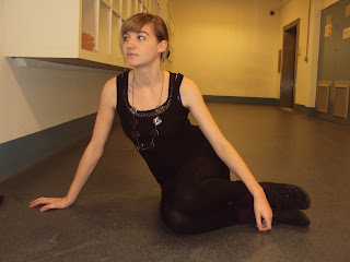
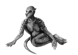
My idea for my final piece is to create a creature that has a balance between human and armadillo but still remain elegant and feminine. The crouching pose above i felt was to animalistic so i experimented though photographs to see what looks natural and relxed looking yet feminine. The feet tucked up to the side shows a bit of incesurity in the body language and reflects the armadillos ability to coil up.
The table in the image would be formed into some kind of rock that will be intergrated with the background.

Supporting Sketches: Feet


Pesky things to draw feet, im ok with the main base of the foot but its the change in shapes and bends of the toes that i need to nail!

Final Photoshop Painting in Progress 2


Reference Image for body position.
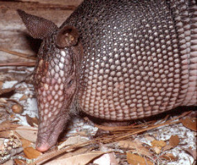
From the rough outline i began to fill in the body with shading with a soft edge brush considering light and dark areas from a light source which is coming from the left.  Over the top i uses a brush that i made from an image of an armadillo using the colour select tool from a chosen section.

   
Image used for scales...


Like the head i added tufts of hair emerging through the scales on the arms and feet.

Once i had completed my b+w drawing using the colour overlay i began to add in some colour. The armadillo has brown/ beige tones and i want them to be reflected in my creature. However adding some more beige could give the impression of human skin merged with that of the armadillo, scales imbedded under the skin breaking through.

Wednesday, 20 October 2010

Final Painting in Progress 1


Comparing the head designs on the figure looks alot stronger. 

I have done a series of sketches (i have yet to scan) of different poses and found one that i was happy with. I wanted the pose to be sitting down or crouching because the armadillo has the ability to curl up into a defensive ball.  

Final Armadillo Head Design


After the removal of the wig of hair my design has become more striking because the profile is more defined. Despite taking the hair away the femininity still remains! 

Tuesday, 19 October 2010

The Company of Wolves (1984)

“The Company of Wolves. They're all the company we keep. Even in our dreams.”
Always listen to your Grandma because she knows best! If you was little Rosaleen you should too. The film is based upon a short gothic story by Angela Carter about folklore, werewolves and their sexual connotations. Young naive Rosaleen listens to tales from Grandma about innocent women falling in love with men whom eye brows meet in the middle, mysterious disappearances around the time of a full moon and other forewarned stories. A darker side to little red riding hood lies at the heart of this film bringing all the tales together reducing them down to a meaning of loss of innocence. The Company of Wolves is defiantly not your typical werewolf horror film. If you’re expecting this you will be greatly disappointed.
“Generally, werewolf movies made by European film-makers tend to have more substance and more familiarity with actual werewolf folklore -- it is part of our history after all, while Hollywood has had to create its own werewolf myth over the years. “ - http://www.imdb.com/title/tt0087075/    
Unlike the Hollywood werewolf horrors the film looks into the sexual ideas of werewolves and exerting masculinity rather than it being a straight forward monster, this film sees the meaning beyond that.

Childern Hatching in a Stalks Nest
There are several more hidden references to tales referred to through symbolism like the stone children hatching out of eggs in the stalks nest, the frequent appearance of frogs (the Frog Prince), the spider on the window (Little Miss Muffet), also the telling she-wolf story referring to another one of Angela Carter’s stories Wolf-Alice that features in The Bloody Chamber.

The settings and the imagery is beautifully surreal, which gives the film a fantasy fairytale and dreamlike quality; however some scenes are deeply darkened by bloody events. In the opening scene during Rosaleen’s dream we see her sister feeling for her life from in the wood bumping into giant child hood toys which appear quite sinister in the dark lighting.

 What stands out in this film is the gruesomely cleaver transformation sequences. The image of the wolf ripping its way out of the man’s mouth is one that won’t leave your mind in a hurry! A painfully slow transformation process of ripping flesh and cracking bones showing deep thought to every detail. The transformation appears from the inside out in reference to one of Granny’s warnings about men: “the worst ones are hairy on the inside.” 

Snap Shot of First Transformation Sequence
    “Let's all thank god for Neil Jordan. Not only did he bring Anne Rice's Interview with the Vampire to the screen in an uncompromising, superb adaptation, but way back at the start of his career he also brought us this mini-masterpiece about werewolves.” http://www.imdb.com/title/tt0087075/usercomments
Neil Jordan appears to have a love for gothic novels Ann Rice and Angela Carter’s work appearing in his work. The Gothic genre can be seen in The Company of Wolves in dimly lit scenes in nothing but candle light or fire light. The artistic warmth of the light gives the scenes a fairly tale glow that makes it almost dream like, especially in the story sequences told by Grandma.

Essay Research: Source 1 - Histroy of the Werewolf (Theories)

http://www.monstropedia.org/index.php?title=Werewolf

"A werewolf (Or Lycanthrope) in folklore and mythology is a person who shapeshifts into a wolf, either purposely, by using magic, or after being placed under a curse. The medieval chronicler Gervase of Tilbury associated the transformation with the appearance of the full moon, but this concept was rarely associated with the werewolf until the idea was picked up by modern fiction writers. Most modern references agree that a werewolf can be killed if shot by a silver bullet, although this is more a reflection of fiction's influence than an authentic feature of the folk legends. Werewolves are sometimes held to become vampires after death."

"A recent theory has been proposed to explain werewolf episodes in Europe in the 18th and 19th century Ergot, which causes a form of foodborne illness, is a fungus that grows in place of rye grains in wet growing seasons after very cold winters. Ergot poisoning usually affects whole towns or at least poor areas of towns and results in hallucinations, mass hysteria and paranoia, as well as convulsions and sometimes death. (LSD can be derived from ergot.) Ergot poisoning has been proposed as both a cause of an individual believing that he or she is a werewolf and of a whole town believing that they had seen a werewolf. However, this theory is controversial and unsatisfactory. Witchcraft hysteria and legends of animal transformations, as well as hysteria and superstition in general, have existed across the world for all of recorded history. Even if ergot poisoning is found to be an accurate explanation in some cases, it cannot be applied to all instances. An over-reliance on any one theory denies the diversity and complexity of such occurrences."

Previous Research - Marvel: The Armadillo

Looking through Greek mythology and i found no references to an armadillo (which wasn't surprising), however in my search through images of armadillos I came across a Marvel character based on a genetic splice with an armadillo.

Fact File:

Universe: Marvel Universe
Real Name: Antonio Rodriguez
Aliases: None
Identity: Secret
Citizenship: U.S.A. (criminal record)
Place of Birth: San Antonio, Texas
First Appearance: Captain America #308

"Little is known about the background of Antonio Rodriguez other than that he has a criminal record and wife named Maria. His wife critically stricken with an undiagnosed disease, Rodriguez took her to every doctor who would see her but none were able to determine the nature of her illness, let alone help her. In desperation, he sought Dr. Karl Malus, a criminal scientist who specializes in the generation and bestowal of superhuman powers, whom he had heard about while in prison. Malus agreed to try to cure her in exchange for the man agreeing to become his test subject and employee for an indefinite period of time."

"Malus subjected the man to an experimental process that combined genetic material from an armadillo with the man's genes. The Process caused the man's strength to increase drastically, his skin to transform into a tough, organic armored plate, and his hands to grow thick tough claws."

I'm not a big fan of comics but it was still useful to look at how they approached the splice. The character being male they took the armoured plated skin of an armadillo and layered them across the the body empathising the muscles on the arms legs and back. When it comes to my splice I will need it to look feminine so i cant go overboard with muscles like they have, but possibly find a way thats more sutble.

Notes from Sketchbook

Life Drawing Week 5

2 Hour Study 
This week we had a life model and a skellington to draw. From my perspective the skellington was right infront of the model so i decided to focus just on the stucture of the skellington. I was really pleased with the overall results and it was good to take the extra time to add extra details. In an hour and a half i had completed the skellington but i felt it was just floating in the middle of the page so i grabbed a brown coloured pencil to fill in the background to add a bit of depth.

Robot Jim Animation

I had to upload my video on to some elses youtube account as i stupidly forgot the password for mine!! XD

Maya Texturing Tutorial

Ceramic

Chrome

Glass

Glow

Gold

Plastic

Silver